When I began this blog my intention was to document my journey into digital scrapbooking. I love to look back and see how I have changed in style, but it is so fun to think about all the things I've learned along the way through trial and error and through some amazing digital scrapbooking classes. I've not shared as many tips and tricks as I would have liked to but hope to get back to doing so now that things have slowed down a bit for me on the class front. I like showing off my pages and hope they bring inspiration to others and a few times, I've blogged a bit about the touches I've put on my scrapbook pages and I'd like to keep doing that -so I'm doing that again today! And you can find these types of layout construction discussions going forward on my blog as, "Anatomy of a Page." So let's take a look at the page I have today.
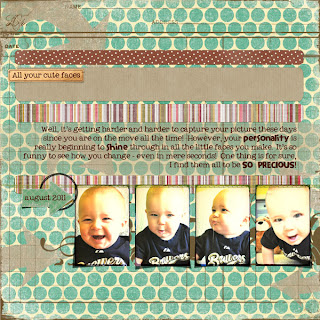
I completed this page as part of the September Blueprint Challenge at
Design House Digital and the template comes from Gennifer Bursett. And here is what I'd like to share:
1. Layer Masks: I enjoy using them not only because they are non-destructive, meaning they won't actually change the item on that layer so you can redo them as many times as you want to get them right, but secondly, they can provide some great layering effects. I began this template with the cardstock paper and put the circle paper over it. By including a layer mask on the circle paper layer I was able to use an arrow brush I made to stamp on it a few times and allow the cardstock to show through. It's more interesting than simply stamping down with a color and by changing the brush opacity you can control just how much shows through.
2. Shadowing: If you look closely, I have not used the same type of shadow on the entire page. This is simply up to you personally but I find that it's fun to create interest with shadows, especially to make objects look realistic as if they are not flat on the page. Let's focus in on this one a bit here:
The arrow appears to be peeling off the page! There are several ways to accomplish this task but for now I will share how I did it here. First, I used the styles to add a drop shadow at a 45 degree angle to my page. Adjust the settings to your preference (you can always change them later!). Then, I right clicked on the layer effect in my layers panel and choose "Create Layer." This moves the shadow down to it's own layer. With that new shadow layer selected, I choose Edit - Transform - Warp. Then I pulled on the corners of the shadow to adjust where it was showing until I got the above.
3. Text on pattern paper: I have blogged before about my love for using pattern paper. I do like the simplistic or minimalist designs as well but I now realize that I am most often drawn to patterns and distressing to create visual interest. However, it often leaves you wondering about putting text on a page! Let's look closer at this:
I've drawn on it a bit to highlight to you the difference in the paper in these two spots. In order to not lose the text amongst the patterned paper I did three things. First, I made sure to chose a font that was somewhat bold and easy to read. A script font would not have worked well here. Second, I chose a dark color that would contrast with most of the page. And finally, I used a brush at a low opacity to scratch away some of the pattern to the cardstock below. This way, your eye takes a break from the pattern and focuses on the text. Well, at least that's what I hope!
Hopefully you've found some of this interesting, helpful, or inspiring. Now, go do some scrapping!
Credits: Weathered Overlay by Celeste Knight; Cardstock 2, stitched tag, swirl brush, TTV Texture by Jessica Sprague, Old boris pp1 by Queen of Quirk; Joyful Paper 3 from December '09 and arrow from Lots of Labels September '09 by Creativity by Crystal; Tiny Red Dot paper from Tricolor pack by In the Making Designs; straight green stitch from Warm Wuv & Soft Hugs by Liv.E Designs; Half in circle brush 4 by Splendid Fin; Fonts: Elephants in Cherry Trees and My Own Topher.


